
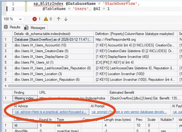
How to Draw Line Graphs in SSMS
Ever just need a quick visualization of some numbers to get a rough idea of the trend, like this:
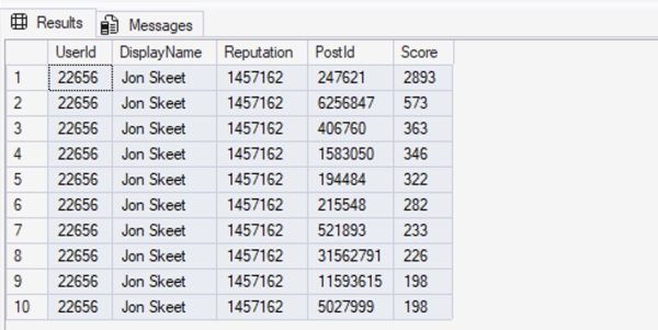
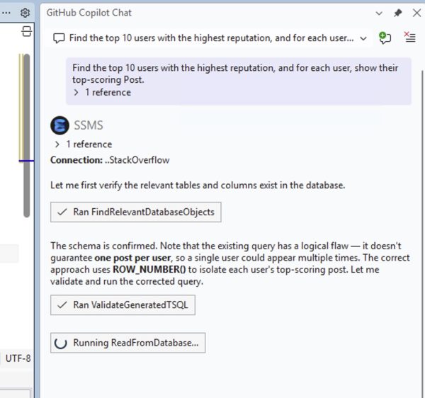
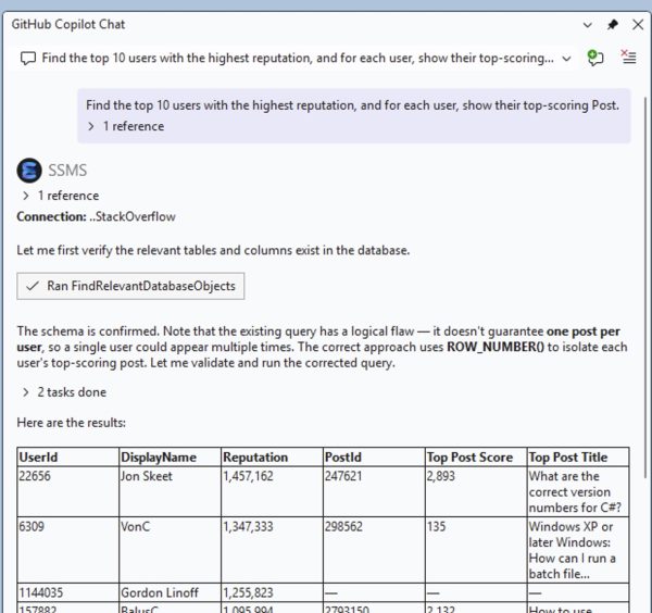
Option 1: ask Copilot to write the query for you.
In SSMS v22.3 and newer, with the results query on your screen, open up SSMS Copilot and copy/paste this into the prompt:
Given the query in this window, graph the results as a line chart in the SSMS Spatial Results tab using these rules:1. Wrap the original query in a CTE called SourceData2. Create a ScaledData CTE that scales X values to 0–300 and Y values to 0–100 using window functions MIN/MAX OVER()3. Build a LINESTRING geometry from the scaled points4. Use STDifference to cut holes in the line where data points are, so tooltips don’t conflict5. Use STBuffer(3) to make each data point a large circle6. UNION ALL the line (with holes) and the circles, with the line row having NULL for all non-geometry columns7. The first column in the SELECT should be the X-axis label, the second column should be the Y-axis measure, and the third column should be the geometry — so tooltips show meaningful data when hovering over circles
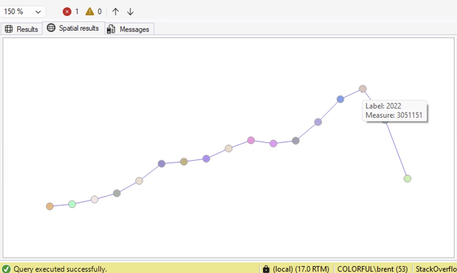
Use a large model (like Claude Opus 4.6 or newer) for the best results. It’ll write the query for you, and if you’ve been living your life right, you’ll get something like this:
|
1 2 3 4 5 6 7 8 9 10 11 12 13 14 15 16 17 18 19 20 21 22 23 24 25 26 27 28 29 30 31 32 33 34 35 36 37 38 39 40 41 42 43 44 45 46 |
-- Created by GitHub Copilot in SSMS - review carefully before executing WITH YearlyData AS ( SELECT YEAR(CreationDate) AS Yr, SUM(1) AS UsersCreated FROM dbo.Users GROUP BY YEAR(CreationDate) ), ScaledData AS ( SELECT Yr, UsersCreated, -- Scale X: years to 0-300 range (wide) (Yr - MIN(Yr) OVER ()) * 300.0 / NULLIF(MAX(Yr) OVER () - MIN(Yr) OVER (), 0) AS X, -- Scale Y: users to 0-100 range (short) UsersCreated * 100.0 / NULLIF(MAX(UsersCreated) OVER (), 0) AS Y FROM YearlyData ), LineGeom AS ( SELECT geometry::STGeomFromText( 'LINESTRING(' + STRING_AGG(CAST(X AS VARCHAR(20)) + ' ' + CAST(Y AS VARCHAR(20)), ', ') WITHIN GROUP (ORDER BY Yr) + ')', 0) AS Geom FROM ScaledData ), AllCircles AS ( SELECT geometry::UnionAggregate(geometry::Point(X, Y, 0).STBuffer(3)) AS Geom FROM ScaledData ) -- Line with holes cut out where circles are SELECT NULL AS Yr, NULL AS UsersCreated, lg.Geom.STDifference(ac.Geom) AS Geometry FROM LineGeom lg CROSS JOIN AllCircles ac UNION ALL -- Circles on top SELECT Yr, UsersCreated, geometry::Point(X, Y, 0).STBuffer(3) AS Geometry FROM ScaledData; |
Voila! Graph. Un-check the “Show grid lines” box on the SSMS results tab because the X/Y axis won’t make sense.
Option 2: use this user-defined function.
I asked Copilot to bundle this into a reusable piece of code so that I could use it for any query. It sets up a user-defined table type, then a function that accepts that user-defined table type as an input parameter:
|
1 2 3 4 5 6 7 8 9 10 11 12 13 14 15 16 17 18 19 20 21 22 23 24 25 26 27 28 29 30 31 32 33 34 35 36 37 38 39 40 41 42 43 44 45 46 47 48 49 50 51 52 53 54 55 56 57 58 59 60 61 62 63 64 65 66 67 68 69 70 71 72 73 74 75 76 77 78 79 80 81 82 83 84 85 86 87 88 89 90 91 92 93 94 95 96 97 98 99 100 101 102 103 104 105 106 107 |
-- Created by GitHub Copilot in SSMS - review carefully before executing -- Step 1: Create user-defined table type for input data CREATE TYPE dbo.GraphInput AS TABLE ( SortOrder FLOAT, -- Controls point ordering on X-axis Label NVARCHAR(100), -- Displayed in tooltip Measure FLOAT -- Y-axis value displayed in tooltip ); GO -- Step 2: Create the graphing function CREATE FUNCTION dbo.fn_GraphSpatial ( @Data dbo.GraphInput READONLY ) RETURNS @Result TABLE ( Label NVARCHAR(100), Measure FLOAT, Geometry geometry ) AS BEGIN DECLARE @XRange FLOAT = 300.0; DECLARE @YRange FLOAT = 100.0; DECLARE @CircleRadius FLOAT = 3.0; DECLARE @MinSort FLOAT; DECLARE @SortSpan FLOAT; DECLARE @MaxMeasure FLOAT; DECLARE @PointCount INT; SELECT @MinSort = MIN(SortOrder), @SortSpan = NULLIF(MAX(SortOrder) - MIN(SortOrder), 0), @MaxMeasure = NULLIF(MAX(Measure), 0), @PointCount = COUNT(*) FROM @Data; -- Pre-compute scaled coordinates DECLARE @Scaled TABLE ( Label NVARCHAR(100), Measure FLOAT, X FLOAT, Y FLOAT, SortOrder FLOAT ); INSERT INTO @Scaled (Label, Measure, X, Y, SortOrder) SELECT Label, Measure, CASE WHEN @SortSpan IS NULL THEN @XRange / 2.0 ELSE (SortOrder - @MinSort) * @XRange / @SortSpan END, CASE WHEN @MaxMeasure IS NULL THEN 0 ELSE Measure * @YRange / @MaxMeasure END, SortOrder FROM @Data; -- Insert data point circles INSERT INTO @Result (Label, Measure, Geometry) SELECT Label, Measure, geometry::Point(X, Y, 0).STBuffer(@CircleRadius) FROM @Scaled; -- Build the connecting line (2+ points required) IF @PointCount >= 2 BEGIN DECLARE @LineWKT NVARCHAR(MAX); SELECT @LineWKT = 'LINESTRING(' + STRING_AGG( CAST(X AS VARCHAR(20)) + ' ' + CAST(Y AS VARCHAR(20)), ', ' ) WITHIN GROUP (ORDER BY SortOrder) + ')' FROM @Scaled; DECLARE @Line geometry = geometry::STGeomFromText(@LineWKT, 0); -- Cut holes where circles are so tooltips don't conflict DECLARE @AllCircles geometry; SELECT @AllCircles = geometry::UnionAggregate( geometry::Point(X, Y, 0).STBuffer(@CircleRadius) ) FROM @Scaled; INSERT INTO @Result (Label, Measure, Geometry) SELECT NULL, NULL, @Line.STDifference(@AllCircles); END RETURN; END GO -- Usage example DECLARE @data dbo.GraphInput; INSERT INTO @data (SortOrder, Label, Measure) SELECT YEAR(CreationDate), CAST(YEAR(CreationDate) AS NVARCHAR(100)), COUNT(*) FROM dbo.Users GROUP BY YEAR(CreationDate); SELECT * FROM dbo.fn_GraphSpatial(@data); |
To use it, insert your data into the user-defined table type. In this example below, I’m loading in the top 10 biggest locations in the Stack Overflow Users table:
|
1 2 3 4 5 6 7 8 9 10 11 12 13 14 15 16 |
DECLARE @data dbo.GraphInput; WITH TopLocations AS ( SELECT TOP 10 Location, COUNT(*) AS People FROM dbo.Users WHERE Location <> '' GROUP BY Location ORDER BY COUNT(*) DESC ) INSERT INTO @data (SortOrder, Label, Measure) SELECT ROW_NUMBER() OVER (ORDER BY Location) AS RankNumber, Location, People FROM TopLocations ORDER BY Location; SELECT * FROM dbo.fn_GraphSpatial(@data); |
And voila:
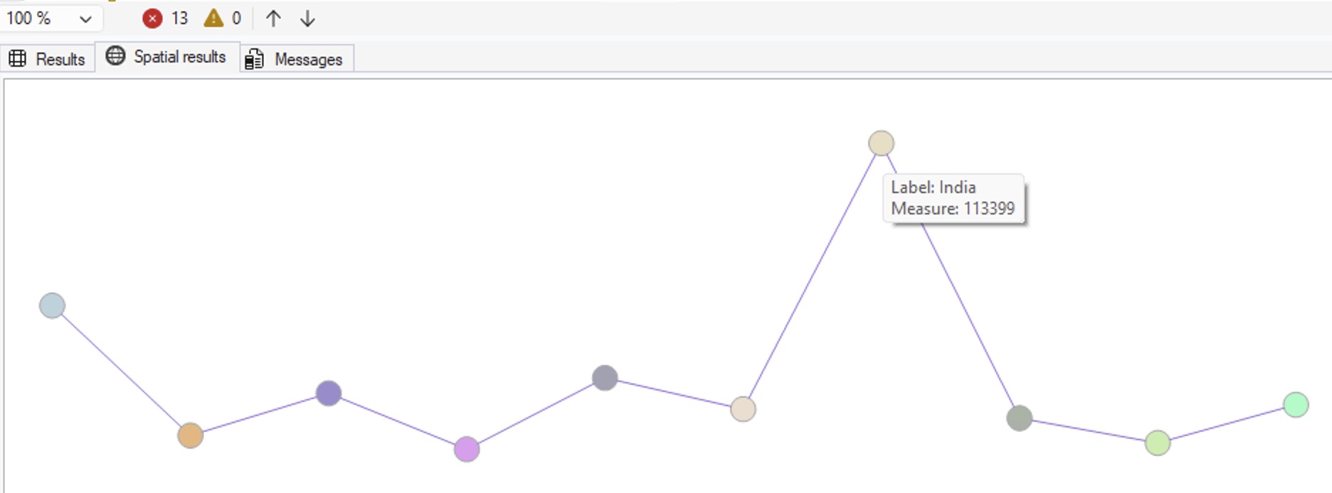
Line charts don’t make as much sense for that particular set of data – you’d probably want bar charts or column charts instead. I’ll leave that to you and your robot friend to work on.
If you wanna watch me work through this with Copilot to come up with the queries, here’s a video of me working on it. Enjoy!
And no, this isn’t my April Fool’s post, hahaha. This does actually work – although I obviously wouldn’t recommend it for any end-user-facing stuff. It’s just fun to have a nice, quick, easy visualization that you can copy/paste into emails or presentations.


 If your company is hiring, leave a comment. The rules: