Free Video: Deadlocks: Let’s Do One, Understand It, and Fix It
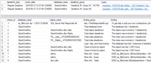
You keep getting warnings and emails about deadlocks, but let’s be honest: you’re not really sure how they happen or what to do about it. In this one-hour session from the SQLBits conference, I will show one, use sp_BlitzLock to analyze it, then fix it. If you like this video, check out the SQLBits YouTube…
Read More


