
Building SQL ConstantCare®: Why We Avoided Graphs
When we started building SQL ConstantCare®, one of my early decisions was to focus on a text-based interface. I wanted to just simply tell you what I’d do in your shoes. If users wanted to see more evidence behind the recommendations, I’d show it – but otherwise, I’d hold off and let them ask.
The experience has been really cool – for the most part, folks have just said, “This is really useful, actionable stuff!” It’s also been really neat to watch the number of alerts go down on peoples’ servers over time as they work through the most important easy-to-fix issues, then move on to tougher tasks.
Customers mention graphs –
but only because they’ve been misled.
But from time to time, the subject of graphs comes up – but not in the way you’d expect. It comes in the form of customers saying, “Whoa, I didn’t know that – nothing shows as abnormal or high in my monitoring tool.” Last week, when I was explaining to a customer what their server’s real problem was, they had an ah-ha moment. They forwarded over a screenshot from their monitoring tool to help explain why they hadn’t been able to get to root cause analysis:
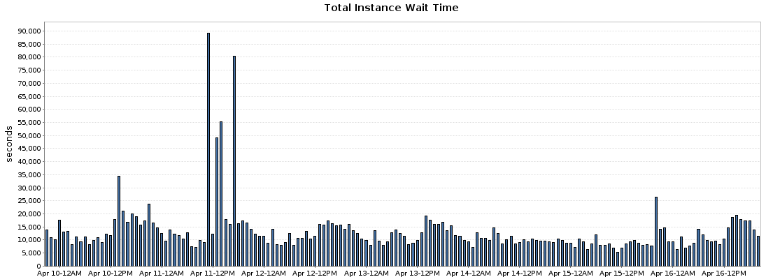
Ouch. The poor user – there was absolutely no way they were going to get anything actionable out of a graph like that. Here’s why:
The units of measure don’t match. One axis is in seconds, the other axis is in hours (or days, depending on how you look at it.) At the very least, they should be in the same time scale – so the reader can say things like, “In 4 hours, SQL Server spent 2.5 hours waiting on stuff.”
Auto-scaling makes interpretation much harder. The graphs automatically re-adjust their axis to make sure that you always have peaks and valleys. If you look at 5 different servers, they all have 5 different sizes for their peak. The only way you can understand if a server is working hard is to jump back and forth between different servers, saying to yourself, “Alright, this one’s peak is at 80,000, but this other one’s peak is at 800,000, so I guess this other one is worse off.”
Poison wait types aren’t called out. Some wait types like THREADPOOL, RESOURCE_SEMAPHORE, and PREEMPTIVE_DEBUG are truly catastrophic even when they’re in small numbers, and they indicate issues you need to work on first. In the case of the bar graph above, the customer was facing THREADPOOL poison waits – the SQL Server service seemed locked up and unresponsive – but they looked in their monitoring tool and nothing showed up as problematic. (And no, those times when you see the huge spikes? That’s not when their performance emergency was happening.)
When wait types are called out, they mislead the reader. Classic example from the above product – when the user breaks out the list of wait types, they see which queries are having the wait, not the ones causing the wait. When a query is waiting on THREADPOOL, it’s not because there’s something bad about that query. The problem is the other queries that are consuming so many other worker threads – often unnecessarily. The poor end user is led down the exact wrong path.
Finding the real root cause with that kind of tool is like trying to find a needle in a haystack – except the needle is yellow, and all the hay has been cut down to needle sizes. You’re gonna get pricked.
All of the above is fixable – sure, you could design a monitoring system with graphs that led you to the right solution instead of actively obfuscating it away from you. Heck, even just the act of me posting this blog post is probably going to influence a developer somewhere to say, “Whoa, we need to make that graph more understandable” – and hopefully they’ll get that fixed.
Instead, we focused on simple task-based emails: we analyze the metrics, and we tell you in plain English what you should do. You can see a couple examples of ’em over at the product page.
I do watch one chart with extreme happiness, though: last week, we blew past 600 servers. That’s one chart where I look forward to automatic scale adjustments.

Want us to help you decipher all your database’s confusing metrics and mentor you into faster, more reliable SQL Servers? Join the 300+ folks who’ve signed up already.

6 Comments. Leave new
Just did a back of the envelope (which is likely wrong!) but… I calculate you are generating aprox. 44 GB per server per day. That seems awfully high….
Mitch – that’s the terabytes of data held on the servers, not the data we’re gathering.
ah!! That explains it! 🙂
Isn’t that the the sequel movie that Ryan Reynold’s starring in? Threadpool 2?
Don’t you mean the SQL?
*bows to Erik* well played!