
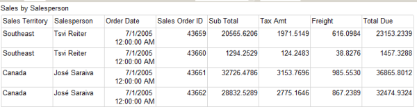
I could be talking about the tables in my database – I do make them skinny by using the right data types – but in this case I’m talking about SQL Server Reporting Services tables. You’ve seen them before. The average table is bland and boring, with nothing to distinguish it from the next, and no reason for you to remember the data in it.
Is this memorable?
Being the Tim Gunn of SSRS, I’m going to transform this table so it looks good.
Formatting
The default formatting isn’t easy to read. For example: for Order Date, I only want to see the date; and I want the sales columns to show dollar signs and decimal points. All of this can be done using the Format property of a cell. (You can find formatting options here.)
I set my OrderDate text box to “d” for short date, and my Subtotal, Tax Amt, Freight, and Total Due text boxes to “c” for currency.
I do other minor cleanup as well – I set the font of the report title to bold, I set the font of the column headers to bold, and I adjust the width of some of the columns.
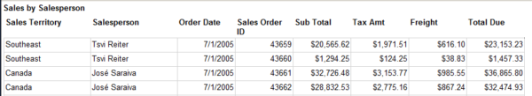
The report is looking better already.
Grouping
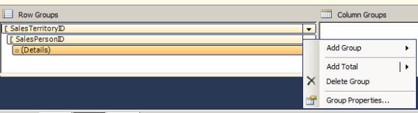
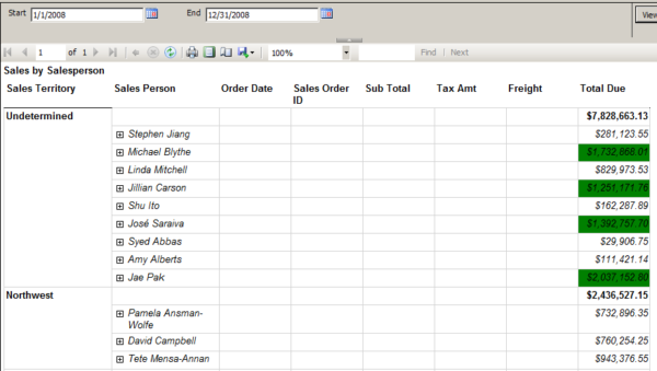
The order of the records isn’t the way I want to see it. We’re looking at the information sorted by order ID. The purpose of this report is to see, at a glance, which sales territory and which sales person have the highest sales for a given date range. I need to add groups for territory and salesperson.
Groups can be added at the row and column level, by using the grouping pane. I add two groups to this table – one based on sales territory ID, and the other based on sales person ID.

I add totals at the group levels and preview the report again. It’s much easier to read now.

Toggling
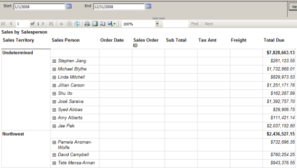
If I exported this report to PDF, it would be 27 pages. No one is going to read through all of that to try to figure out which territory had the most sales. I need to either reduce the information in the report, or make it more readable. If I wanted to show only the totals at the territory and salesperson levels, I could select the detail row and set the Hidden property to True – but the blank rows would still appear under the groups. Or, I could delete the detail row – but then I couldn’t view the data for a sales person if I wanted to.
What I really want to do is make it so I can collapse and expand each section as needed. In SSRS, this is called toggling. I pick the row I want to change the visibility for – in this case, the detail row – and then I set a field that I will toggle on.
In the group properties, I go to the visibility section. I choose whether this row should be hidden or visible when the report is first run. To enable toggling, I check “Display can be toggled by this report item” and choose a text box – in this case, sales person.

This is a huge improvement in readability. The next step is to add toggling at the sales person level, triggered by the sales territory.
Expressions
Not all properties in SSRS are true/false or a set list of options. Many can be configured dynamically, using expressions. Expressions are based on Visual Basic, and can help you do things like set dynamic background colors on cells, change grouping on the fly, or perform mathematical calculations.
Let’s take a simplistic and not-too-realistic example: I want the value at the salesperson level to have a green background if the sales are over $1,000,000. (This isn’t terribly realistic because I’m letting the user choose a date range. It would be more realistic if that was a one-year goal and the user had to pick a specific year.)
In the text box Background Color property, I choose Expression and the expression builder opens. Using an IIF statement, I say, if the total due field is greater than or equal to 1,000,000, the color should be green; otherwise, it should be white.
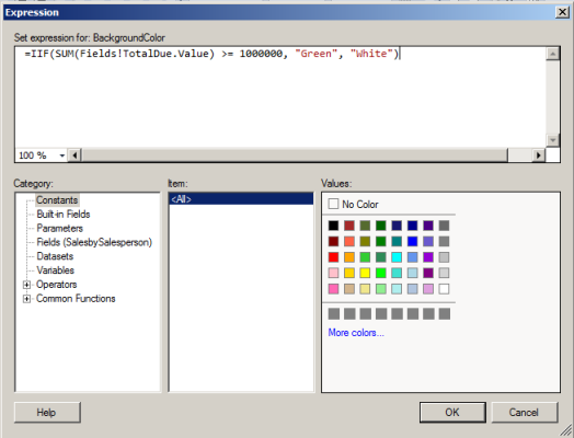
Now, at a glance I can tell which sales people were “high performers” – without having to look at each field and mentally calculate that.
Expressions allow you to extend the functionality of properties greatly. Become familiar with expressions. Then become great at them. You’ll thank yourself for this bit of knowledge.
Make it Work
Building an SSRS table can be a quick, simple process. Your report will look simple. I challenge you to consider how you can improve it. In each report, pick one element – the formatting of a cell, the ordering of the data, something that can be visualized – and change it. Your reports will stand out, and tell the story better.

5 Comments. Leave new
Nooooooooooooooooooo…………..
Not the dreaded Textbox5. How could you Jes…
HA! Think of it as “Things I could do to make this report better!”
Some suggestions:
:: Alternating row colours. These can obviate the need for the awful grey (or worse, black) cell borders that make any report look like an excel dump.
:: I like to make the headers of right justified columns also right justified.
:: If I have room in a date column, I’ll use a three letter abbreviation of the month name (Jun, Apr etc) so that the Americans and English can live in relative peace and harmony eg d MMM yyyy. Obviously this can’t be a hard and fast rule for all situations.
:: Given that we’re looking at $7 million in the above example, I’m tipping that the cents are of no significance, and should not be reported. They are just “noise” on the report that distracts the reader. In fact I’d be pushing to round to the nearest hundred dollars for the same reason – but this would depend on the relevant industry standard for reporting and the preference of the audience. Same thing for reporting percentages. Only report the number of decimal places that are actually meaningful. 12.34% might be meaningful where the range is between 12.00% and 12.50%. It’s much less likely to be meaningful where the range is between 0% and 100%. In that case 12% is probably fine.
:: I try to avoid hardcoding the colour change logic into the report. I think it’s easier to maintain (and find) and more portable if it’s in the source stored procedure. In some cases it will be possible to have properties like this in database tables, which is easier again to maintain. All just depends on the requirements.
:: Table positioning is important, as is some consideration for whether the row and column headers should repeat when the report spills over onto the next page. This matters whether the report is viewed in print or online.
:: If you embed graphics (like a company logo) in your reports, and you write hundreds (or thousands) of reports over many years… and then your company changes its logo and tells you all the reports need to be fixed… then you’ll find yourself in a spot of bother. If however, your logo points to a file in a folder on the Report Server then you should be able to make the transition much more easily.
“…Not the dreaded Textbox5…” When I started using Reporting Services in earnest I was horrified at the preponderance of this naming convention. The origins of my horror were my previous use of Visual Studio for more conventional coding. It did not take long to realise that Reporting Services does not really fit the mould of the programming languages that visual studio was originally designed for. Now I see renaming dozens of objects in every report as a big investment of time for very little gain.
Great ideas Greg! I’m with you on naming conventions – the time it takes to rename every textbox in reports quickly outweighs the effectiveness.